Luminia case matkailuyrityksen visuaalinen ilme

The visual identity was renewed cost-effectively in a phased approach

CASE: Visual identity design and production of materials for a holiday resort

In this project, the visual identity of the holiday resort was renewed in a phased and cost-effective way. The new visual identity makes the holiday resort more attractive and ensures a consistent brand presence across all customer touchpoints.


Initial situation

The visual identity of the holiday resort reflected a period when the company operated mainly as a local business.

As operations expanded, there was a need for a brand identity that communicates quality, versatility, and appeals to international customers.

For cost reasons, the redesign needed to be implemented in phases rather than as a single large-scale project.

The company also lacked a consistent approach to marketing and communication: there were no defined slogans, standard company descriptions, or a unified image library.

Project goal

The objective of the project was to build a modern tourism brand that supports the company’s growth and makes its services attractive to different target groups.

At the same time, the goal was to create practical tools that make it easy to use the visual identity in everyday operations.

What was done

At the beginning of the project, the holiday resort’s colour palette and typography were redesigned. The colour scheme was built around shades of blue, reflecting Finnish lake landscapes and supporting the visual identity of a tourism brand.

Next, key messages, slogans, and company descriptions were defined and written for different use cases.

An image library was created for the holiday resort using both original photography and stock images. The collection was further expanded through a dedicated photoshoot project.

The visual identity was compiled into a brand guideline, which serves as a reference for both the company and its subcontractors.

Instead of implementing all changes at once, the new identity was gradually rolled out across different materials according to the company’s needs.

Luminia icon results

RESULTS 

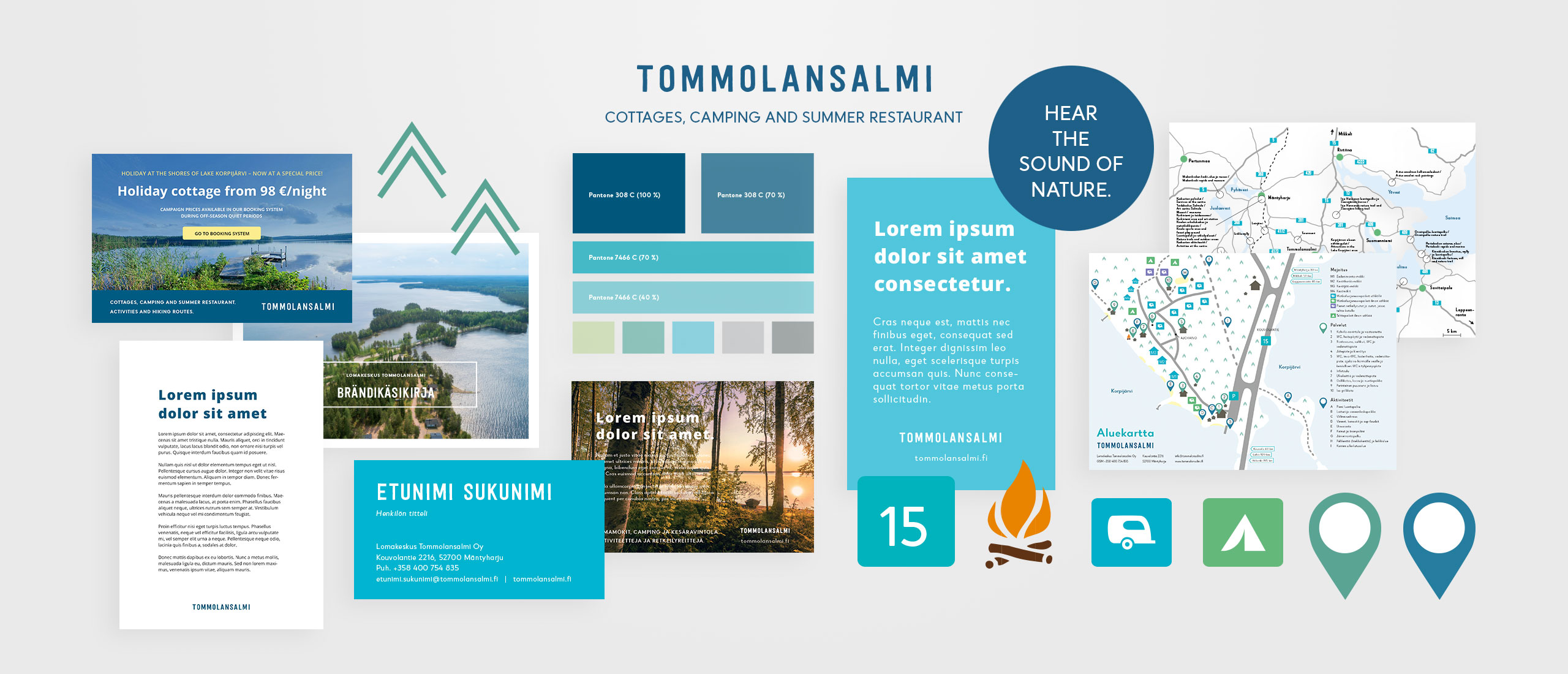
  • The visual identity is consistent across all key materials.
  • The brand guidelines support the use of the visual identity and make collaboration with subcontractors easier.
  • Ready-made templates speed up the production of marketing and communication materials.
  • The image library provides high-quality visuals for a wide range of uses.
  • The image library provides high-quality visuals for a wide range of uses.The holiday resort’s brand is clear and easily recognisable across all customer touchpoints.

Luminia icon lessons learned

PROJECT LESSON 

A visual identity can also be successfully renewed in phases — what matters most is a clear direction and consistent execution throughout the process.

Luminia icon project information

PROJECT INFORMATION 

Client: a Finnish SME operating in the tourism industry
Client relationship duration: over 15 years
Projektin sisältö: visual identity design and production of materials
Projektin laajuus: a long-term project combining strategic design and hands-on implementation
Asiakkaan vastuualueet: defining requirements and preferences
Omat vastuualueeni: concept development, brand and key message development, visual design, and production of final materials. This included selecting photos from the company’s own image library, sourcing stock imagery, image editing, illustration work, copywriting, and layout design.